Remember when the first HiDef TVs came out in the 1990s and one of the most instantly eye-pleasing elements was the much wider screen that allowed us to see so much more of whatever was being shown — more of the NFL football field in those first CBS HiDef broadcasts, more of Jay Leno’s set and audience on “The Tonight Show,” one of the earliest network programs in HiDef.

Nearly all of that additional visual real estate, and perhaps even more, appears to have been slowly and subliminally hijacked by network marketing and promotional people. It seems like the area of the screen featuring the program itself is often smaller than the image that filled my old analog set.
It’s getting harder and harder to enjoy a primetime TV series without being visually assaulted with an array of increasingly larger and more prominent pop-up promotions for upcoming shows. (Another advantage of watching TV series and movies on Blu-ray Disc, which have no pop-ups and no forced commercials that are nearly impossible to avoid online.)
I feel like I’m trying to monitor all the lights and digital readouts in an airline cockpit when I watch any sporting event these days, from football to NASCAR, with all manner of data and colorful updates flickering and scrolling horizontally across the top and bottom of the screen and even vertically on the sides.

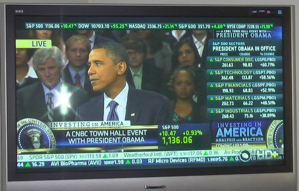
But the worst are the news channels, especially CNBC during stock trading. The tickers, alerts, program promos, network branding, HD logos, and headlines are flying in all directions all over the screen to the point that only about 60% of the actual program is visible vertically and less than 75% horizontally.
Even President Obama didn’t compel CNBC to push any of the clutter off the screen during his recent Town Hall presentation. Flanked by a double-line of fast-moving stock tickers on the bottom of the screen, market sector updates on the right side, revolving market index prices across the top, a much bigger visual presentation in the middle of the screen duplicating the same second-by-second market index movements flashing on the top of the screen, and two giant graphics of Presidential seals bookending a caption of “A CNBC Town Hall Event with President Obama” that was topped with the title “Investing in America” that crept most of the way up the tie of the President (and also duplicated from an even bolder version of that same title a few inches to the right), there was precious little room for Obama himself.
No matter, there was still room to squeeze in another little graphic near his face noting the event was “Live,” in addition to cramming in a promo for the show to follow the President’s Town Hall, and two more graphics letting you know, in case you couldn’t see his face, that the program you were trying to watch featured “President Obama.”
— By Scott Hettrick

Two or three angles on all the garbage on the screen these days…
Most of the stuff they throw up there is trying to generate revenue or is branding (same goal): watch the next program, who’s talking, what channel, HD, weekend of Clint Eastwood movies… I don’t need that. The worst are the moving images edging into the corner of the screen to tempt you to some other program. I’m sure some network exec is proud when he goes to some bar and finds his logo literally burned into the screen of the TV because they always show that one channel, but for most of us it’s just annoyance. Real annoyance. It doesn’t build viewer loyalty, but tears away at it.
The local news program often likes to wrap up with the “video of the night” and usually they’ve got so much junk on the screen and just as the chip shot is approaching the hole, they throw a “Video of the Night” banner up that literally covers the final approach and dropping of the ball in the hole. Yet all the anchors, who are watching on uncluttered monitors, marvel at the amazing shot. We at home can only imagine.
Many people might prefer hiding more of the grandeur of Obama with scrolling, flashing, dancing bear info and ads and be accompanied with a muting of the dramatic and hollow words he learned in Ivy league cheerleading. On the good side, the junk on the screen also covers up the unimpressed, bored and dozing people propped up behind him.
On the other hand, for many news stories I’d prefer more and meaningful information on the screen. While the newscaster may be pretty, she’s not really the most important part of the story. And her wonderful voice may be using words I don’t know (city, street, people, and chemical names), or more likely the sentence is so long that I can’t tie the 38% at the beginning to the $49 billion in the middle to the involved category of product that the story is about. I would rather have the “talking head” pushed into a corner of the screen and a Powerpoint-like summary of the most critical facts taking up the bulk of the screen. Sometimes you have to wait for the same story to crawl across the bottom of the screen on the ticker (3 words visible at a time) to find the facts you were looking for or back up the DVR, turn on the closed caption, and hope the speed typing caption-writer didn’t skip over or totally muck up the guy’s name. .
On the other hand (yes, I do have 3 hands) there’s Turner Classic Movies, that always has a very clean (if black and white) picture, plus not one advertisement — the way cable was in the early days, and what sold us all on cable – you pay for cable and those revenues meant they didn’t need to show you advertising. Does someone want to explain to me what happened in a way that doesn’t include the equivalent of “we wanted more money”?
By the way, I notice that the video on the Web page next to your big ole head shot and name (that add nothing to the story) has banners of 3DHollywood and produced by … oh, that’s you, plus labeling of speakers all throughout it too. Practicing what you preach?
Thanks Tom. Good thoughts, even with the political editorial re: Obama, which is off point but amusing. As for the branding on the video you mention, I’ll give you a partial touche’, with my only defense that the website name and my name is only at very bottom in the blank/black space of the screen, not covering or obscuring any part of the video. And that’s only because videos are ripped so much on the Web that I need to protect myself and my brand so that viewers seeing it outside of this website know where it really came from.
As for my big ole head shot, yeah, that’s just a time-honored magazine/newspaper journalist tradition of including the columnist’s head shot with his column. When you say the photo and byline add nothing to the story, that’s true. Guess you could say the same about any author’s name on a book or any TV anchor or reporter who tells you their name when reporting the story, or even the name of athletes on their jerseys (doesn’t add anything to their game). It’s how you get to know the name of people providing you information and learn to trust or distrust or enjoy their writing/reporting. And, of course, it’s also self-serving — it’s how we all promote ourselves so we can be distinguished from others and therefore make a living. I can’t speak for others in this trade but I’m not ashamed to admit that I’m not doing this in hopes of remaining anonymous and broke.
Thanks again for taking the time to comment.
Scott
Good point…the only solution is to buy a larger TV! I find all such things highly distracting.
LCD panel makers are sniffing around 21:9 format screens, which would allow extra widgets around the broadcast action – which would make your problem twice as bad.